Best Retail Redesigns of 2016
02.10.2017
2016 certainly was the year of change at retail. From augmented reality in-store, to self-help kiosks, to digital and mobile integration, we saw all sorts of innovations finally come to life on the sales floor. While many retailers updated their shopping environments to accommodate this new level of technology and changing consumer behaviors, there were only a handful that knocked the ball out of the park. Here are five retailers who thought outside of the box and completely redesigned their spaces in 2016 to attract the next generation of consumers.
5. Staples
In an increasingly digital world with more remote employees, Staples has seen profits go down. To stay on top of this trend, the retailer has undergone some creative modifications to remain relevant and draw traffic into the store. Staples teamed up with Workbar, a communal workplace agency, to create Workbars in several store locations on the East Coast. For a monthly fee, remote workers can have a personal desk in a shared workplace, meet likeminded employees, use Wi-Fi, rent a locker, have access to conference rooms and free office supplies, drink unlimited coffee, and more—all within a Staples store! While we are doubtful that the traditional office job will go away anytime soon, Staples’ solution to increase foot traffic, as well as attempt to adapt to the digital age, is commendable and worthy of highlight.

Source: Boston Globe
4. Macy’s
After a significant drop in sales in 2015 and 40 stores slated for closure, Macy’s sought fresh ways to attract and retain loyal customers to their retail stores. The result definitely earns a rank among the top redesigns of 2016 for the scale at which the changes were made, as well as the creativity used in these clever renovations. First off, Macy’s has ditched the existing products and brands that aren’t selling well, leaving more room for the brands and services that are. The department store plans to incorporate their @Macy’s service as a pickup point for customers who order online but want to pick up their orders in store. The store also plans to incorporate a personal stylist program so that shoppers can have looks created and waiting for them when they get to the store, creating efficiency along with a personal touch. Each department has been revamped so that customers can come in and walk around, doing away with the service counter-type shopping experience. The furniture department is better integrated, with accessories decorating existing sections, rather than having one of their own.
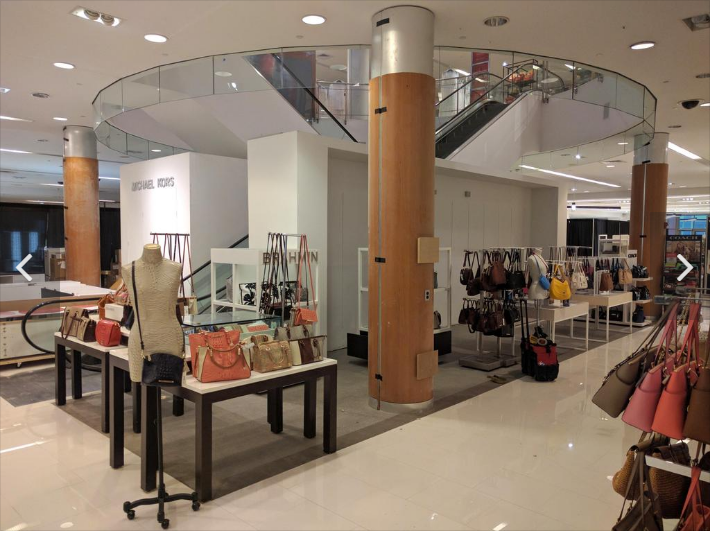
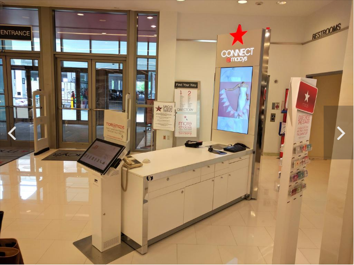
Source: BizJournal
3. Walmart
Walmart’s 2016 redesign existed purely in the realm of reimagining their displays. When their customers admitted that the retailer’s inventory was less extensive than their competition, (which is reportedly untrue) Walmart reorganized their merchandise to better represent their selection. This included a more strategic aisle creation and organization, a fresh produce wall for the more health-conscious customer, and more visually appealing wooden boxes to display fresh produce. Adjusting the heights of displays across the store and adding attractive chalkboard signs to the bakery area completed the look, so that customers can more easily locate and appreciate Walmart products. Will this redesign steal away customers from higher-profile grocer’s or even glamour grocers like Whole Foods? While that seems like a far-fetched goal, only time will tell how much of a difference this grocery area redesign will make.

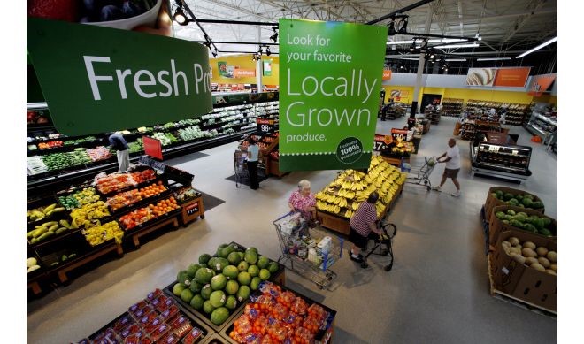
Photo Credit: USA Today
2. Target
At the end of 2015, Target announced that it would roll out a set of redesigns in 25 of stores in the greater LA area (including our Irvine location!) throughout Spring of 2016, which was later dubbed the LA25. The renovations included better lighting and signage, a more strategic layout, and super-cool highlighting of locally sourced merchandise and produce. They also provided samples of merchandise found only in their online store with detailed instructions on how to purchase it through their app and hired more employees to walk the floors and assist with purchasing.
Target has taken initiative in rearranging its items in a more cohesive and intuitive fashion, streamlining the shopping experience by placing items that are frequently purchased together (hot dog buns, ketchup and mustard) together so that shoppers don’t have to search in different areas of the store as well as heightening the aesthetic of the store with its new black, grey and red color scheme and wooden grocery display boxes; which are reminiscent of a local farmer’s market. The new setup includes a rotating front display that features seasonal items, placing home and fashion at the store’s forefront. An evolved version of One Spot lives on, reinvented as Bullseye’s Playground. Target is listening to customer’s critiques and is attempting to remedy existing issues in a streamlined, exciting way.


Source: Good Housekeeping
1. The Apple Store
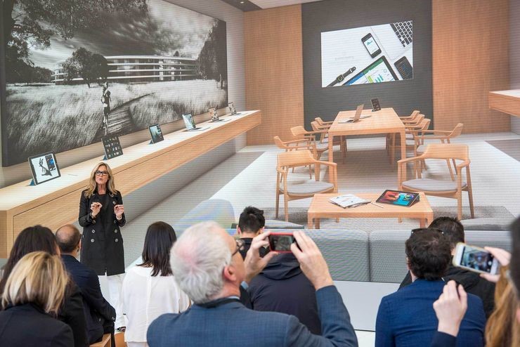
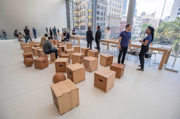
The tech giant began implementing their new, town square-esque look in select locations in May 2016, beginning with their San Francisco Union Square location. Gone are the days of the loud Genius Bar, now transformed into the Genius Grove, where consumers and Apple Geniuses can sit side by side on leather benches, surrounded by live trees, while remedying issues. Cases and accessories that line the Avenue are packaging-free, allowing for hands-on engagement and interaction with Apple products, while Pros stand by to answer questions and educate customers on the products’ full capabilities. The Boardroom boasts space for small businesses and consumers alike to learn business and computer skills, while the Forum allows for community game nights, music video premiers, and more with its 35-foot screen and wooden stools. Select locations will feature the Plaza, an outdoor park-like space where local artists will perform every few weekends.
The dramatic shift from minimalist space to flooded town square is said to be prompted by the first downshift in Apple’s products in several years, causing them to alter their image and revitalize the in-store experience. The relaxed atmosphere, especially in contrast to the futuristic tech-y vibe of the current store layout, accurately reflects the role that their products have in our lives. Laptops and smart phones are no longer revolutionary, ultramodern technology, but are an integral part of our everyday lives. Instead of being the place to observe the latest tech in awe, Apple has created a place to gather, learn, and use their devices to their fullest potential.
Source: Bloomberg.com
As preferences and trends continuously evolve, retailers must adapt accordingly to be able to provide retail experiences that will entice consumers to come to their stores. These companies have gone above and beyond to create better experiences for their consumers and stand out among their competitors with their unique store redesigns. What are some retail experiences from 2016 that caught your attention?
Contact us here with your favorite redesigns from last year or if you’re interested in redesigning your own retail experience!